You can have a perfectly good AI-generated image and still end up with a bad final result simply because you chose the wrong shape.
A portrait that looks balanced in a square format can suddenly cut off someone’s head when converted to a vertical image. A beautiful landscape can lose its main subject when forced into a wide banner. And an image that looks fine on a phone may feel strangely empty when used as a website header.
The problem isn’t always the image itself.
Often, it’s the aspect ratio.
If you regularly create AI images for Instagram, websites, thumbnails, stories, wallpapers or other digital content, understanding AI image aspect ratios will help you make better decisions before generating or editing an image.
Instead of generating an image first and trying to force it into every platform afterward, you can choose the composition based on where the image will actually be used.
What Is an Aspect Ratio?
An aspect ratio describes the relationship between an image’s width and height.
For example:
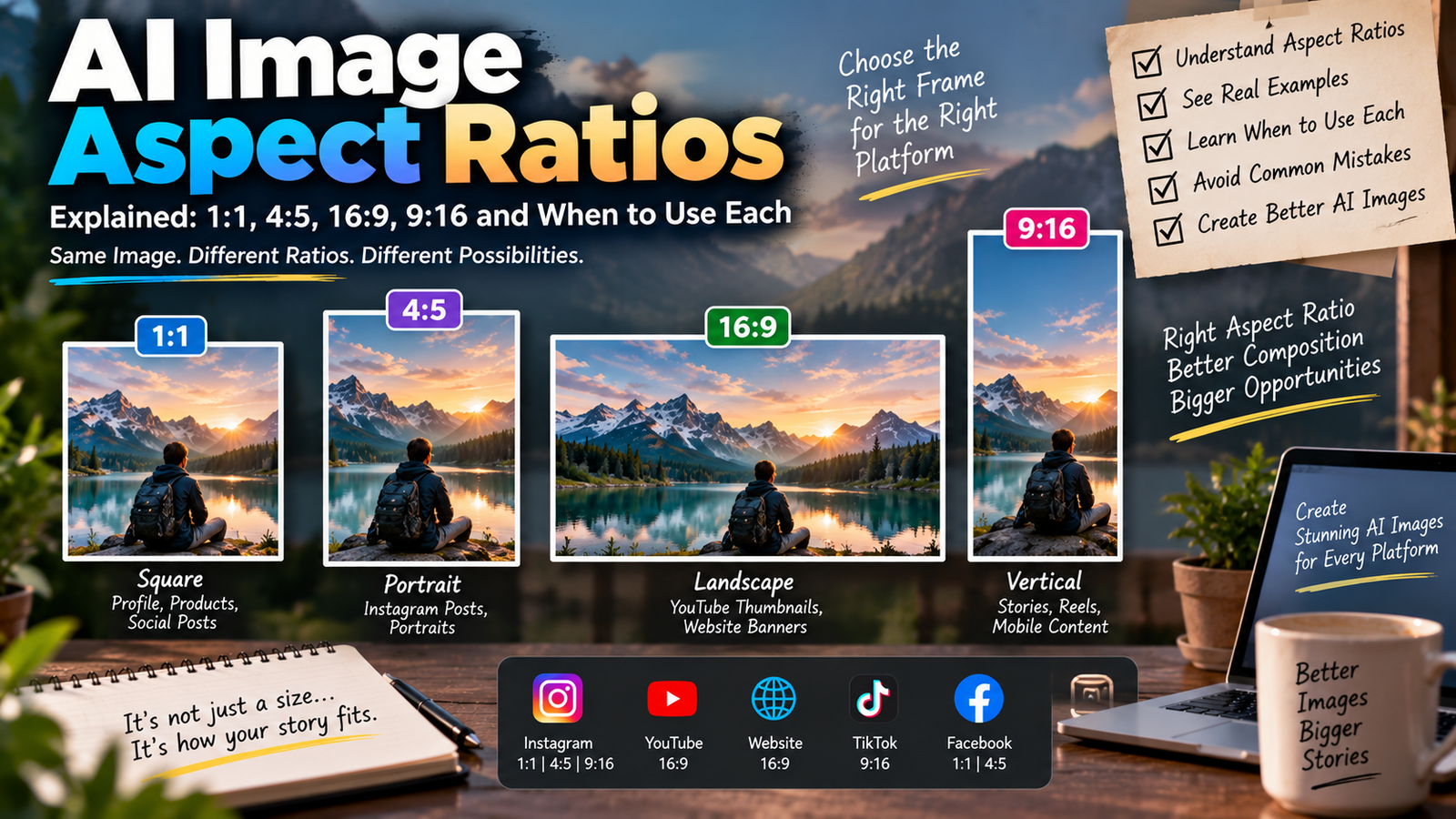
1:1 means the width and height are equal.
4:5 means the image is four units wide for every five units of height.
16:9 means the image is sixteen units wide for every nine units of height.
9:16 means the image is nine units wide for every sixteen units of height.
The ratio doesn’t tell you the exact pixel dimensions.
For example, all of these are 16:9:
- 1280 × 720
- 1920 × 1080
- 2560 × 1440
The files have different resolutions, but their shape is the same.
That’s an important distinction.
Aspect ratio describes shape. Resolution describes the number of pixels.
Why Aspect Ratio Matters in AI Image Generation
When you generate an image with AI, you’re not just asking the model what should appear in the picture.
You’re also working within a particular frame.
That frame influences composition.
Imagine asking AI to create:
A person standing beside a mountain lake.
If the frame is wide, the model has plenty of horizontal space for:
- Mountains
- Lake
- Sky
- Landscape
- Subject
If the frame is vertical, the composition has to change.
The person may occupy more of the frame, while parts of the landscape become less prominent.
So the aspect ratio isn’t just an export setting.
It can influence how the image is composed from the beginning.
1:1 Aspect Ratio: The Square Format
A 1:1 image is square.
Examples include:
- 1080 × 1080
- 2000 × 2000
- 3000 × 3000
The square format gives you equal horizontal and vertical space.
This makes it relatively flexible.
It’s useful when you want the subject to sit centrally without emphasizing either the horizontal or vertical direction.
When 1:1 Works Well
A square frame can work particularly well for:
- Profile-style images
- Product images
- Social media graphics
- AI artwork
- Album-style layouts
- Simple portraits
- Icons and visual cards
It can also be useful when you don’t yet know exactly where the image will be published.
Because there isn’t a strong horizontal or vertical emphasis, it can be easier to adapt later.
The Problem With Square Images
A square frame isn’t ideal for every subject.
Imagine a person standing from head to toe.
A square composition may force you to:
- Move the camera farther away
- Reduce the subject’s size
- Crop part of the environment
- Change the pose
The same problem can happen with landscapes.
A wide mountain range doesn’t naturally fit inside a square without sacrificing some of the horizontal scenery.
So 1:1 is flexible, but it isn’t universally best.
4:5 Aspect Ratio: A Useful Portrait Shape
4:5 is taller than it is wide.
Examples include:
- 1080 × 1350
- 1200 × 1500
- 1600 × 2000
This shape gives you additional vertical space while remaining relatively compact.
For portrait-oriented photography, that can be very useful.
A person’s body can occupy more of the frame without requiring an extremely tall canvas.
Why 4:5 Works Well for Portraits
Imagine photographing someone standing outdoors.
With 1:1, you might have to crop some of the person’s body or reduce their size.
With 4:5, you have additional height.
That extra space can help preserve:
- Headroom
- Full-body composition
- Clothing
- Legs
- Ground area
- Vertical background elements
The result can feel more natural without making the subject tiny.
4:5 and Social Media
Portrait-oriented social media posts often benefit from using more vertical screen space.
A taller image can occupy more of the viewer’s display than a square image.
However, platform specifications can change.
If you’re preparing content specifically for a platform, check its current publishing requirements rather than relying on an old “best size” chart.
The broader lesson remains useful:
Choose the frame based on how people will actually view the image.
16:9 Aspect Ratio: The Wide Format
16:9 is one of the most familiar landscape formats.
Examples include:
- 1280 × 720
- 1920 × 1080
- 2560 × 1440
It’s widely associated with:
- Video
- YouTube thumbnails
- Presentations
- Website banners
- Desktop displays
- Landscape graphics
Its wide shape gives you substantial horizontal space.
Why 16:9 Is Good for Landscapes
A landscape scene naturally benefits from horizontal space.
Imagine:
- A mountain range
- A city skyline
- A road stretching into the distance
- A beach
- A large architectural structure
A wide frame lets the viewer see more of the environment.
You can position the main subject on one side and leave the other side relatively open.
That empty area can also be useful for adding text later.
16:9 for Website Featured Images
A wide image can work particularly well as a blog featured image because it fits naturally into many horizontal layouts.
For example, you might place:
Main subject → center/right
and leave:
Text space → left
This creates a composition that feels intentionally designed rather than simply cropped from a portrait.
For a website like an AI photo-editing resource, this can be particularly useful for tutorial thumbnails and educational graphics.
9:16 Aspect Ratio: The Tall Mobile Format
9:16 is the vertical counterpart of 16:9.
Examples include:
- 1080 × 1920
- 1440 × 2560
It’s strongly associated with full-screen vertical content.
Think about how you hold your phone.
The screen is taller than it is wide.
A 9:16 composition takes advantage of that space.
Why 9:16 Works for Vertical Content
This format is useful for content designed to occupy a tall mobile screen.
It works naturally for:
- Vertical videos
- Stories
- Reels-style content
- Mobile-first graphics
- Full-screen advertisements
- Phone wallpapers
The key advantage is simple:
The image fills the vertical screen instead of leaving large unused areas.
Why a Good 16:9 Image Can Fail in 9:16
Imagine a wide photograph of five friends standing across a beach.
The entire composition works because everyone fits horizontally.
Now crop the image into 9:16.
You may only be able to keep:
- Two people
- Part of the beach
- A small portion of the background
The original composition has effectively been destroyed.
This is why simply cropping every image into every ratio isn’t a good workflow.
Sometimes the image needs to be recomposed or expanded, not merely cropped.
Aspect Ratio and Cropping Are Not the Same Thing
This is an important distinction.
Changing the aspect ratio can involve cropping.
For example:
16:9 → 1:1
To make the wide image square, you may need to remove large portions from the left and right.
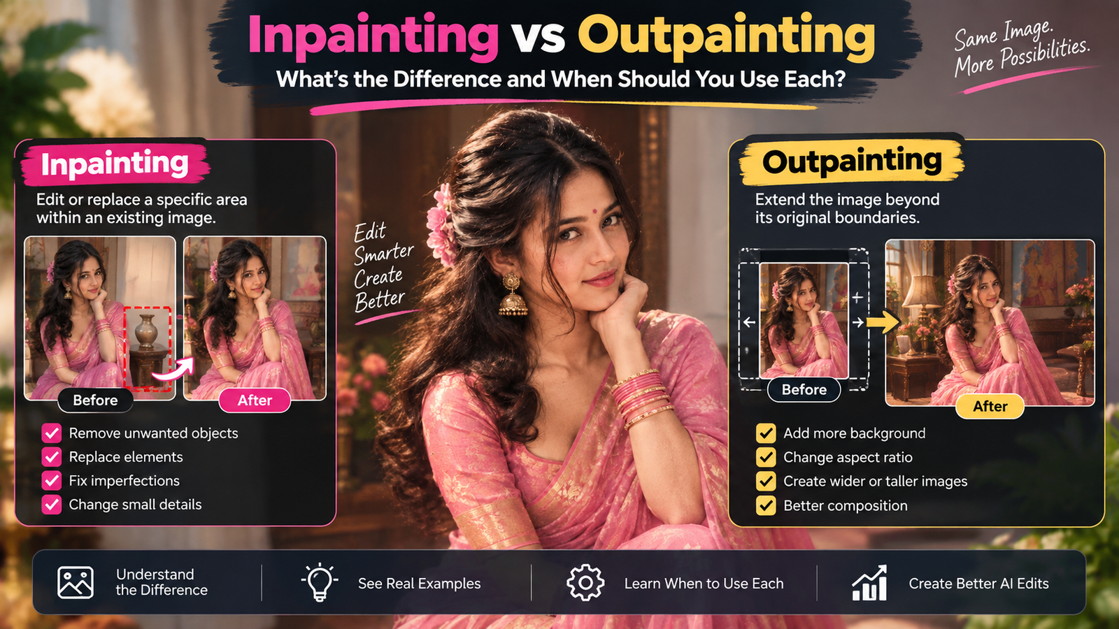
But you can also change the canvas using AI image expansion.
Instead of removing content, AI can potentially create additional visual space around the original subject.
That can be much better when you want to preserve the original composition.
AI Expansion Can Be More Useful Than Cropping
Imagine a portrait where the person’s head and shoulders are perfectly positioned.
You need a wider banner.
Cropping won’t help.
It would remove parts of the existing image.
AI expansion can instead create additional background around the subject.
For example:
Original
Person + narrow background
↓
Expanded
Person + additional environment + negative space
This approach gives you more flexibility when adapting one photograph to a different format.
But AI Expansion Is Still Generative
There is an important limitation.
When AI expands an image beyond its original boundaries, those new areas didn’t exist in the original photograph.
The AI has to generate them.
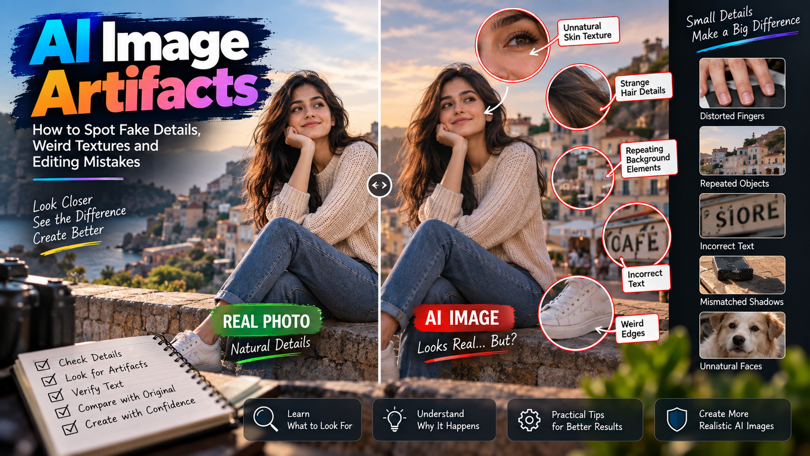
That means you should inspect the expanded area for:
- Strange objects
- Repeated patterns
- Incorrect architecture
- Lighting differences
- Perspective problems
- Artificial textures
We covered this broader composition problem in our guide to improving photo composition with AI.
Aspect Ratio and Subject Placement
The position of your subject becomes increasingly important as the frame changes.
Consider a portrait subject positioned exactly in the center.
That can work well for a square image.
But for a website banner, a centered subject may leave you with very little space for text.
You might instead position the person toward the right side.
This creates negative space on the left.
The same photograph can therefore feel completely different simply because the subject’s position changes.
What Is Negative Space?
Negative space is the relatively empty area surrounding or beside the main subject.
It doesn’t necessarily mean completely blank space.
It could be:
- Sky
- A plain wall
- Softly blurred background
- Water
- A simple floor
- An uncluttered landscape
Negative space is useful because it gives the viewer’s eyes somewhere to rest.
It also gives designers room for:
- Headlines
- Logos
- Buttons
- Captions
- Promotional text
Why AI Needs to Know Where You Want the Subject
Suppose you’re creating a blog banner.
You need the person on the right because your headline will go on the left.
If you simply ask AI:
Create a realistic portrait of a person outdoors.
the model may place the person in the center.
The image could be beautiful.
But it’s not useful for your intended layout.
A better approach is to describe the composition itself.
For example:
Place the subject slightly to the right and leave clean visual space on the left for a headline.
You’re not just describing the subject.
You’re describing how the frame should be used.
Aspect Ratio Changes the Feeling of an Image
Different ratios can create different visual experiences.
Square
Feels balanced and contained.
4:5
Feels portrait-oriented without becoming extremely tall.
16:9
Feels expansive and cinematic.
9:16
Feels immersive and mobile-focused.
None of these is inherently better.
The correct choice depends on the story you want the frame to tell.
Choosing a Ratio for a Portrait
Suppose you’re creating an AI portrait.
Start by asking what you need to show.
Headshot
A square or portrait ratio can work well.
Half-body portrait
4:5 can provide useful vertical room.
Full-body portrait
A taller frame may be more appropriate.
Cinematic environmental portrait
16:9 can be excellent if the environment is important.
Mobile full-screen portrait
9:16 makes sense when the image needs to fill a vertical display.
The subject should determine the frame—not the other way around.
Choosing a Ratio for Landscapes
Landscapes generally benefit from horizontal space.
For example:
Wide mountain scenery → 16:9
Panoramic cityscape → wide format
Vertical waterfall → portrait format
A waterfall is a good example of why you shouldn’t automatically choose landscape for every outdoor photograph.
The physical structure of the subject matters.
A tall waterfall may actually become more impressive in a vertical frame.
Choosing a Ratio for Products
Product photography depends heavily on the intended layout.
A simple product on a clean background can work in:
- 1:1
- 4:5
- 16:9
The important question is what the product needs.
If the product itself is tall, a vertical composition may make more sense.
If you’re creating a wide website banner featuring the product alongside text, 16:9 may be more appropriate.
The product’s shape and the surrounding design should influence the decision.
Choosing a Ratio for Group Photos
Group photographs present a special challenge.
If several people stand next to one another, a wide frame often gives everyone enough room.
Trying to squeeze a large group into a narrow vertical composition can make people appear cramped.
If you need a vertical version, consider whether the people can be arranged differently.
For AI editing, you should also be careful not to let the model unnecessarily alter people’s faces or body positions.
Our guide on editing group photos with AI without changing people’s faces covers that problem in detail.
Aspect Ratio and Camera Composition
Professional photographers often think about composition before pressing the shutter.
AI image generation requires a similar mindset.
Don’t start with:
“Which ratio is popular?”
Start with:
“What needs to fit inside this frame?”
For example:
A mountain landscape may need horizontal room.
A full-body fashion photograph may need vertical room.
A product advertisement may need empty space for copy.
A portrait for a profile picture may benefit from a square crop.
The intended composition should come first.
Don’t Generate One Image and Crop Everything Later
This is probably one of the biggest mistakes beginners make.
They generate one beautiful 16:9 image.
Then they try to use the same file for:
- Square post
- Vertical story
- Website banner
- Thumbnail
- Poster
Some versions may work.
Others will require aggressive cropping.
Important elements can disappear.
A better approach is to decide which formats actually matter before creating the image.
When You Should Generate Separate Versions
If an image is important and will be used across multiple formats, consider creating separate compositions.
For example:
Website banner
16:9
Subject positioned to leave text space.
Social post
4:5
Subject larger and more vertically balanced.
Story/reel
9:16
Subject positioned for a tall mobile frame.
These aren’t necessarily three completely different concepts.
They can be three compositions designed around the same visual idea.
Consistency Doesn’t Mean Identical Crops
Suppose you’re creating a campaign with the same person and visual style.
You want the images to feel related.
That doesn’t mean every image needs exactly the same crop.
A better approach is to maintain:
- Similar lighting
- Similar color treatment
- Similar subject styling
- Similar visual mood
while adapting composition to the required aspect ratio.
This creates consistency without making every image look mechanically identical.
Aspect Ratio vs Resolution
These two terms are often confused.
Suppose you have:
1080 × 1080
and:
4000 × 4000
Both are:
1:1
But the second image has much higher resolution.
Now compare:
1920 × 1080
and:
1080 × 1920
They contain the same number of pixels, but their aspect ratios are completely different.
The first is:
16:9
The second is:
9:16
So remember:
Aspect ratio = shape
Resolution = pixel dimensions
Why Increasing Resolution Doesn’t Fix the Wrong Ratio
Imagine you have a 16:9 image.
You upscale it from:
1920 × 1080
to:
3840 × 2160.
The image is now larger.
But it is still 16:9.
If you needed a 9:16 vertical image, increasing resolution didn’t solve the problem.
You still need to change the composition or canvas.
This is why resolution and aspect ratio should be considered separately.
How to Avoid Cutting Off Important Subjects
Before changing the ratio, identify the safe area.
Ask:
- Where is the person’s head?
- Where are their hands?
- Where is the main product?
- Which background elements are important?
- Is there enough room around the subject?
If the answer is no, don’t simply crop.
Consider repositioning the subject or expanding the image.
This is especially important for full-body portraits.
Headroom Matters in Portraits
Headroom is the space between the top of a person’s head and the edge of the frame.
Too little headroom can make the image feel cramped.
Too much can make the subject appear oddly small.
When changing aspect ratios, headroom can change dramatically.
A crop that looked balanced in 4:5 may cut into the person’s hair in a square format.
Always inspect the final frame rather than assuming the crop will work.
Don’t Forget Feet and Hands
Full-body photographs have another problem.
When converting to a different ratio, creators often focus on the face and forget the lower part of the body.
You can end up with:
- Cut-off shoes
- Missing hands
- Cropped elbows
- Uncomfortable body framing
Before exporting a portrait, quickly check the entire subject.
The image should feel intentionally framed rather than accidentally cut.
AI Can Recompose, But You Still Need to Direct It
If you’re using AI to adapt an image to another ratio, don’t simply say:
Make this image vertical.
Explain what should happen.
For example:
Expand the environment above and below the original subject, keep the person unchanged, maintain the existing lighting and camera perspective, and create enough vertical space for a full-body composition.
The exact wording will depend on the tool you’re using.
The important principle is to tell the AI what needs to be preserved and what can change.
The Same Image Can Tell a Different Story in Different Ratios
Imagine a person standing on a mountain.
16:9
You see the person as part of a huge landscape.
4:5
The person becomes more prominent.
9:16
The viewer’s attention may move toward the person’s vertical relationship with the mountains and sky.
1:1
The scene feels more contained.
Nothing about the underlying subject has necessarily changed.
The frame changes the story.
That’s why aspect ratio is a creative decision, not just a technical setting.
A Simple Decision Framework
When you’re unsure which ratio to use, ask four questions.
1. Where will the image appear?
Website? Social media? Video? Print?
2. What is the main subject?
Person? Product? Landscape? Architecture?
3. Does the subject need horizontal or vertical space?
This often answers the question immediately.
4. Do you need room for text?
If yes, think about where that text will go before generating the image.
This takes less than a minute but can prevent a lot of unnecessary editing.
Common Aspect Ratio Mistakes
Using 16:9 for Everything
Wide images aren’t automatically better.
Cropping a Full-Body Portrait Too Aggressively
You can lose feet, hands or important background elements.
Ignoring Text Placement
A beautiful image can become unusable once a headline covers the subject’s face.
Confusing Resolution With Aspect Ratio
A larger image doesn’t automatically have the correct shape.
Generating Before Choosing the Destination
You may spend more time fixing composition later.
Stretching the Image
Never simply stretch an image to force it into another ratio.
This can distort people and objects.
Never Stretch a Photograph to Change Its Ratio
Suppose you have:
16:9
and need:
9:16
If you simply stretch the width and height independently, the image becomes distorted.
A person can look unusually thin or wide.
A circular object can become oval.
Buildings can appear warped.
Instead, use:
- Cropping
- Canvas expansion
- Recomposition
- AI outpainting
depending on what the image requires.
When Cropping Is Better Than AI Expansion
AI isn’t always necessary.
If the image already contains enough empty background, simple cropping may be the cleanest option.
For example, if you have a portrait with lots of unused sky, converting it to a slightly taller format may be easy without generating anything new.
Use AI expansion when the desired frame would otherwise remove important content.
Simple editing is often preferable when it achieves the same result.
When AI Expansion Is the Better Choice
AI expansion can be useful when:
- The subject is already perfectly positioned
- Important details would be lost through cropping
- You need more background
- You need a wider banner
- You need a taller mobile composition
- There is enough surrounding visual context for the AI to extend naturally
But always inspect the generated area afterward.
A Practical Workflow for AI Images
Here’s a workflow that works for most creators.
Decide the destination first
Know whether the image is for a website, social platform, video or print.
Choose the aspect ratio
Select the frame that fits the intended use.
Plan the composition
Decide where the subject should sit.
Generate or edit
Create the image with the frame in mind.
Check the edges
Look for accidental crops.
Add text if needed
Make sure typography doesn’t cover important visual information.
Export at appropriate resolution
Don’t confuse a large file with a well-composed image.
Review the final version
Always check the image in the environment where it will actually appear.
A Quick Reference Table
| Aspect Ratio | Shape | Good Starting Use |
|---|---|---|
| 1:1 | Square | Profiles, square graphics, product visuals |
| 4:5 | Portrait | Social posts, portraits |
| 16:9 | Wide landscape | Banners, thumbnails, video-style graphics |
| 9:16 | Tall portrait | Stories, vertical video, mobile-first graphics |
These are starting points, not universal rules.
Platform specifications and design requirements can change, so check the destination when exact dimensions matter.
One More Important Thing: Don’t Let the Tool Choose Everything
AI image generators are designed to make creation easy.
That’s great for beginners.
But if you’re creating images for a website or brand, you shouldn’t let the tool decide every aspect of the composition.
You should decide:
- What is important?
- What should be visible?
- Where should the subject sit?
- Where will the headline go?
- Which format will the image use?
Then let AI handle the visual generation.
That’s a much stronger workflow than generating first and fixing everything afterward.
Final Thoughts
Understanding AI image aspect ratios isn’t about memorizing a list of numbers.
It’s about understanding how the shape of the frame changes the way an image works.
A square frame can create a balanced composition. A 4:5 frame gives portraits more vertical room. A 16:9 frame is useful when the environment or horizontal space matters. A 9:16 frame is designed around tall, mobile-first viewing.
The most important decision is not:
“Which aspect ratio is the best?”
It’s:
“Which aspect ratio gives my subject enough space for the way this image will actually be used?”
If you know the destination before generating the image, you can position the subject correctly, reserve space for text, avoid unnecessary cropping and reduce the amount of corrective editing later.
And when one image needs to work in several formats, don’t be afraid to create separate compositions rather than forcing one crop to do everything.
The best AI image isn’t simply the one with the highest resolution or most impressive details. It’s the one whose composition fits its purpose.