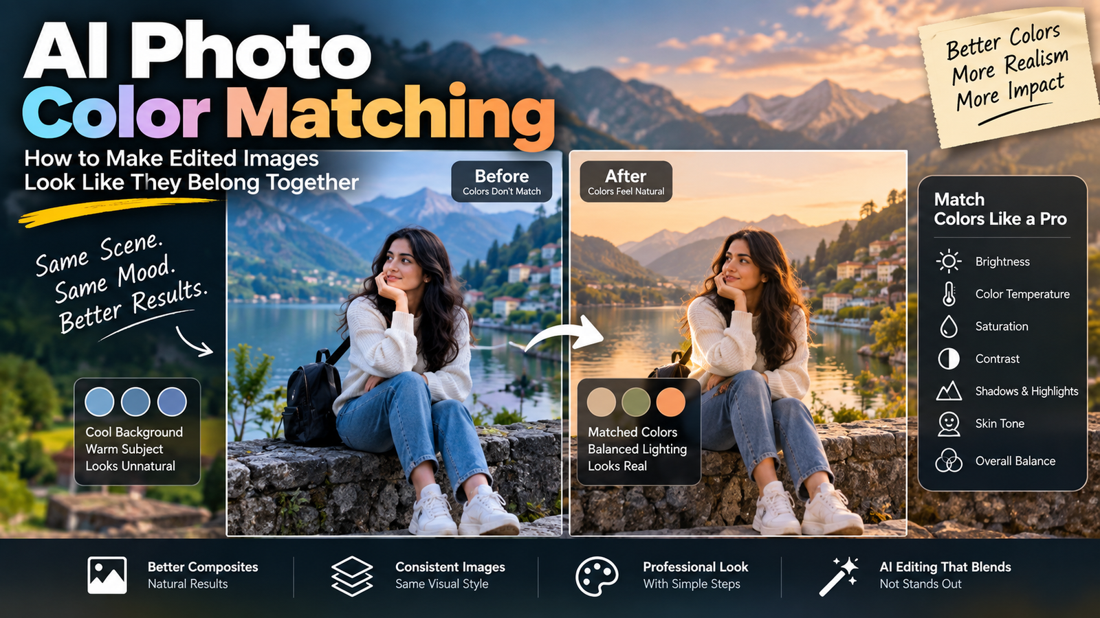
AI photo color matching is one of those editing skills that can make a huge difference without being immediately obvious.
You can have a beautifully edited portrait, a realistic new background, or an AI-generated object, yet something can still feel “wrong.” The subject may look slightly too warm while the background is cool. The skin may have a green tint while the surrounding environment looks neutral. A new object may have the correct shape and lighting but completely different colors from the rest of the photograph.
This is where color matching becomes important.
Color matching is not simply about making an image more colorful or applying a cinematic filter. The goal is to make different parts of an image feel as though they were photographed under the same conditions.
In practical AI photo editing, this can be especially useful when replacing backgrounds, combining elements, creating social media visuals, or trying to make several photographs look like part of the same collection.
Adobe’s current Photoshop documentation includes tools for matching colors between images, layers and selections, while Lightroom also provides reference-based workflows for comparing the appearance of an active photo against a reference image.
What Is AI Photo Color Matching?
AI photo color matching means adjusting the colors, brightness, temperature, contrast and overall color balance of an edited image so that its different elements visually work together.
Imagine a simple example.
You take a portrait indoors and use AI to replace the background with a beach scene.
The person originally has warm indoor lighting on their face. The beach background has cool daylight.
The AI may successfully replace the background, but the person can still look like they were photographed somewhere else.
The problem isn’t necessarily the background.
The problem is the relationship between the colors.
A successful edit should make the subject and environment appear to share the same visual conditions.
Why Color Matching Matters in AI Photo Editing
Human eyes are very good at noticing when colors don’t belong together.
You might not immediately say:
“The white balance of the subject differs from the background.”
Instead, you may simply think:
“Something looks fake.”
That reaction often comes from several small differences working together.
For example:
- the subject is warmer than the environment
- the background is more saturated
- skin tones are too bright
- shadows have different color temperatures
- the added object has stronger contrast
- highlights don’t have the same color character
- the background is slightly faded while the subject is extremely sharp
None of these problems has to be dramatic.
Small inconsistencies can be enough to break the illusion.
Adobe describes color matching as a way to make colors consistent between different images, layers or selections, including when combining multiple elements into one composition.
Color Correction and Color Grading Are Not the Same Thing
Before working on color matching, it helps to understand two terms that are often confused.
Color Correction
Color correction is about making an image technically or visually balanced.
You may correct:
- white balance
- exposure
- brightness
- contrast
- unwanted color casts
For example, if a photograph has an obvious blue tint, correcting the color temperature may make it look more natural.
Color Grading
Color grading is more creative.
It can give an image a particular visual mood, such as:
- warm golden tones
- cool blue shadows
- muted colors
- dramatic contrast
- soft pastel colors
- cinematic tones
Adobe describes color grading as a creative process that establishes a coherent visual tone, while correction focuses more on making the image look appropriately balanced.
Why this distinction matters
When combining AI-edited elements, match the basic color first.
Apply a creative grade afterward.
If you add a strong cinematic filter before fixing the mismatch, you can end up hiding the actual problem rather than solving it.
The Four Things You Should Compare First
When trying to match two images, don’t immediately start changing every color.
Start with four basic characteristics.
1. Brightness
Is one element noticeably brighter than the other?
For example:
A person standing in a dark street shouldn’t normally have a face that looks like it was photographed under studio lighting unless there is a believable light source.
Brightness differences can make an inserted subject stand out even when the colors are technically similar.
2. Color Temperature
Temperature usually describes whether an image appears warmer or cooler.
A warm photograph may contain more:
- yellow
- orange
- red
A cool photograph may contain more:
- blue
- cyan
Consider a simple background replacement.
The original person has warm golden-hour lighting.
The new background is a cold blue evening scene.
Even if the background itself looks beautiful, the combination may feel artificial.
The colors need to move closer together.
3. Saturation
Saturation controls how strong or intense colors appear.
Suppose your background has soft, muted colors while the AI-edited subject has extremely saturated clothing.
The clothing may immediately attract attention.
Sometimes reducing saturation slightly is more effective than changing the hue.
4. Contrast
Contrast affects the relationship between light and dark areas.
An AI-generated object may have extremely strong contrast while the original photograph has soft, low-contrast lighting.
That object can look pasted into the scene.
Before changing its actual color, compare its contrast with the surrounding environment.
AI Photo Color Matching After Background Replacement
Background replacement is one of the clearest examples of why color matching matters.
Suppose you have a portrait taken inside a room.
You replace the room with a sunny outdoor location.
The AI may generate a convincing background, but the original subject still carries the visual characteristics of the indoor photograph.
Look at:
- face
- hair
- clothes
- exposed skin
- shadows
- highlights
Then compare those areas with the new environment.
A useful workflow
Original photo → background replacement → brightness adjustment → temperature adjustment → saturation adjustment → shadow/highlight matching → final color grade
Don’t try to solve everything with one dramatic filter.
Work gradually.
How to Tell Which Image Has the Color Problem
This sounds simple, but it is an important editing skill.
When two elements don’t match, don’t automatically assume the newly generated element is wrong.
Sometimes the original subject needs adjustment.
Sometimes the background needs adjustment.
Sometimes both need small changes.
A useful technique is to temporarily view the images or elements separately.
Ask:
Does the subject look natural by itself?
Then:
Does the background look natural by itself?
Finally:
Do they look natural together?
If both look good separately but bad together, the problem is probably their relationship rather than the individual images.
Use a Reference Image Instead of Guessing
A reference image can make color decisions much easier.
Instead of saying:
“Make it look cinematic.”
you can use an actual photograph that has the appearance you want.
You can compare:
- skin temperature
- sky color
- shadow color
- highlight brightness
- overall saturation
- contrast
- dominant colors
Modern Adobe workflows also support reference images for generative editing and image generation. Photoshop’s current reference-image workflow can use a reference to guide either an object or an entire scene, depending on the intended edit.
The important point is that a reference gives you something concrete to compare against.
Don’t Match Every Color Individually
This is a common beginner mistake.
Suppose you’re combining a person with a new background.
You don’t necessarily need the person’s shirt, skin, sky and background objects to have identical colors.
Instead, look for a shared color environment.
For example, a warm sunset photograph might naturally contain:
- warm highlights
- slightly warm skin
- darker neutral shadows
- orange sunlight
- subdued background colors
The goal isn’t to turn everything orange.
The goal is to make the different elements respond to the same visual environment.
Skin Tone Needs Special Attention
Skin is one of the easiest areas to damage during color matching.
If you increase warmth too much, skin can become:
- orange
- yellow
- red
If you cool the entire image too much, skin can become:
- pale
- gray
- slightly blue
That’s why global color adjustments should be checked against the face and other exposed skin.
A useful approach is:
- Match the overall scene.
- Check skin separately.
- Correct obvious color shifts.
- Compare again at normal viewing size.
Don’t sacrifice natural skin just to make the background match.
Match Shadows, Not Just Highlights
Many people focus on the obvious colors in an image.
They look at:
- sky
- clothes
- skin
- walls
But shadows can reveal a mismatch even more strongly.
Imagine a subject photographed in warm sunlight.
Their shadows may contain a subtle cool tone.
If you replace the background and create completely neutral black shadows, the subject can still look disconnected.
Pay attention to:
- shadow temperature
- shadow density
- contact shadows
- reflected light
- highlight color
A realistic photograph isn’t made from one color temperature. Different areas can contain subtle color relationships.
The Background Should Influence the Subject
When you put a subject into a new environment, the environment can affect how the subject should look.
For example:
Forest environment
You might expect subtle green influence in nearby shadows and reflected light.
Sunset environment
You may see warmer highlights and warmer environmental illumination.
Blue-hour environment
Cooler tones may appear across the scene.
Indoor tungsten lighting
Warm yellow-orange illumination can affect skin, clothing and nearby surfaces.
This doesn’t mean you should exaggerate these effects.
The adjustment should be subtle enough that the viewer doesn’t notice the technique.
AI Color Matching vs Applying a Filter
These are two different approaches.
Applying a filter
A filter changes the overall appearance according to a preset or predefined look.
It can be useful for:
- social media styles
- creative effects
- quick color grading
- establishing a mood
Color matching
Color matching starts with the existing visual relationship between images or elements.
The goal is to make them work together.
For example, Photoshop’s Match Color command can use one image as the source for color information and adjust another image, layer or selection to make their colors more consistent. It provides controls for luminance, color intensity and color cast.
That’s why a filter isn’t always the best solution for a composite.
A Simple Manual Workflow for Color Matching
You don’t need complicated color science to start.
Try this sequence.
Step 1: Choose the reference
Decide which part of the image has the appearance you want to preserve.
Usually, this is the original photograph or the environment.
Step 2: Compare brightness
Make the inserted element approximately as bright or dark as the scene.
Step 3: Correct temperature
Move the element warmer or cooler until it feels closer to the surrounding environment.
Step 4: Adjust saturation
Reduce excessive color intensity if the element looks too vivid.
Step 5: Compare contrast
Check whether the inserted element has harder or softer contrast than the rest of the image.
Step 6: Check shadows
Make sure the shadow behavior doesn’t contradict the environment.
Step 7: Check skin
If a person is present, make sure the correction hasn’t damaged natural skin color.
Step 8: View the complete image
Don’t judge only the edited section.
Look at the entire photograph.
A Practical Example
Imagine you have a portrait of a person standing on a street.
You use AI to place them in a mountain landscape.
The AI result looks impressive, but something feels wrong.
You inspect it.
Observation 1
The mountain background is slightly cool.
Observation 2
The person’s face is very warm.
Observation 3
The person’s clothes have high contrast.
Observation 4
The background is soft and slightly hazy.
Observation 5
The subject’s edges are extremely sharp.
Now you know the problem isn’t just “the colors.”
There are several mismatches.
You could:
- cool the subject slightly
- reduce excessive saturation
- soften contrast
- adjust the subject’s highlights
- introduce appropriate environmental color
- make the transition between subject and background more natural
The final image may require only small adjustments.
That’s an important lesson:
Realistic color matching is often about several small corrections rather than one large adjustment.
How to Match Multiple Photos for Instagram
Color matching becomes even more useful when you’re working with multiple photographs.
Imagine an Instagram carousel containing five photographs from the same trip.
One image is warm.
Another is blue.
Another is highly saturated.
Another is dark.
Even though all five photographs are good individually, the carousel may feel inconsistent.
A better workflow is to choose one image as your visual reference.
Then compare the other images against it.
Look at:
- exposure
- white balance
- skin tone
- saturation
- contrast
- dominant colors
Lightroom’s Reference View is specifically designed to place a reference photo beside an active photo while making adjustments, including for maintaining consistency in white balance and overall appearance.
This can be much more reliable than editing every photograph from memory.
What Not to Do
Don’t Increase Saturation to Fix Everything
More color does not automatically mean better color.
Over-saturation can make an AI edit look even less realistic.
Don’t Make Everything the Same Color
A realistic photograph contains variation.
Matching doesn’t mean making every object identical.
Don’t Ignore Brightness
Two images can have similar colors but completely different exposure.
That mismatch can be more noticeable than a slight hue difference.
Don’t Overcorrect Skin
If the background needs to become cooler, don’t automatically make the person’s skin cold too.
Don’t Use a Strong Cinematic Preset as a Shortcut
A preset can create a beautiful style, but it may not solve the actual mismatch between two image elements.
AI Photo Color Matching Checklist
Before publishing an AI-edited image, ask yourself:
Overall appearance
- Do the subject and background feel like the same photograph?
- Is one element noticeably brighter?
- Is one element more saturated?
Temperature
- Is the subject warmer or cooler than the environment?
- Do highlights and shadows make sense?
Skin
- Does the skin remain natural?
- Has the color adjustment introduced orange, yellow or blue tones?
Contrast
- Does the subject have the same general contrast as the scene?
- Are the edges unnaturally sharp?
Environment
- Does the subject appear affected by the surrounding light?
- Do reflections and shadows belong to the same environment?
Final test
Zoom out.
Look at the image for a few seconds.
Don’t analyze it.
Just ask yourself:
Does this look like one photograph or two images placed together?
If your eye immediately notices the separation, continue refining the color relationship.
Final Thoughts
AI photo color matching is less about finding the perfect filter and more about understanding how different visual elements interact.
When an AI-edited photograph looks artificial, the problem may not be the generated object itself. The object might have the correct shape, but its brightness, temperature, saturation or contrast may not belong to the surrounding scene.
Start with the basics:
Brightness → Temperature → Saturation → Contrast → Shadows → Skin Tone → Final Grade
Work in that order and make small changes.
Most importantly, use a reference whenever possible. Instead of relying entirely on memory, compare the edited image with a real visual target.
Once you develop the habit of checking color relationships rather than individual colors, AI photo editing becomes much easier to control. The final result doesn’t have to look “perfectly edited.” It simply needs to look like everything belongs in the same photograph.
That is usually what makes an AI edit feel convincing.