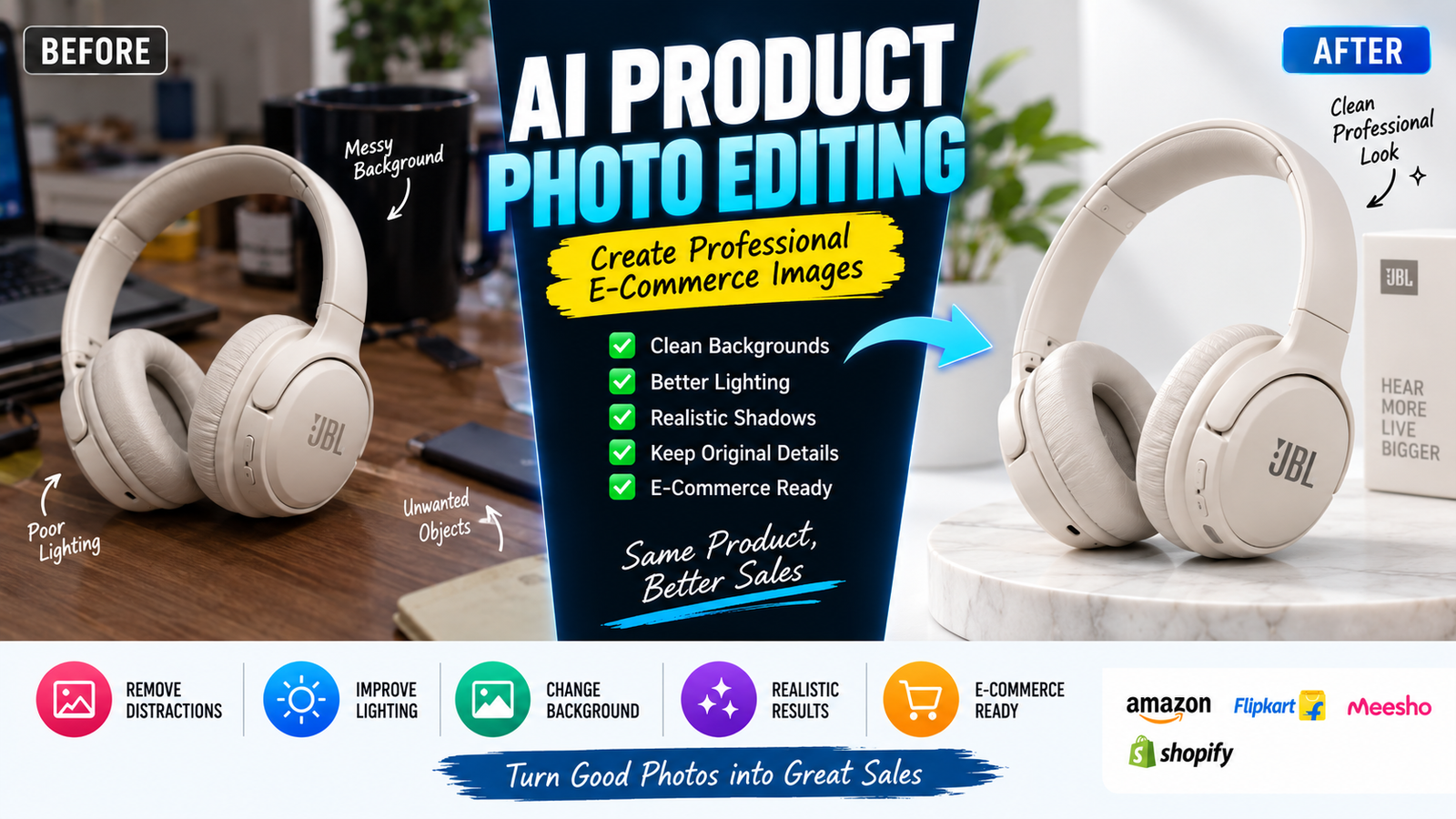
A product can be excellent, but poor photography can make it difficult to sell online. A dark background, uneven lighting, distracting surroundings, inaccurate colors, or weak composition can make a product look less professional than it actually is.
AI product photo editing can solve many of these problems without requiring a complete studio setup. You can clean a background, improve lighting, create a realistic product scene, remove distractions, and prepare multiple visual variations from a single product photograph.
However, there is an important rule: AI should improve the presentation of a real product without changing what the customer is actually going to receive.
If an AI editor changes the product’s color, shape, texture, logo, packaging, dimensions, or important features, the resulting image may become misleading.
This guide explains how to use AI for product photography while keeping the product accurate, realistic, and commercially useful.
What Is AI Product Photo Editing?
AI product photo editing is the use of artificial intelligence to modify or enhance a photograph of a real product.
Instead of manually performing every editing task, an AI system can help with operations such as:
- Background removal
- Background replacement
- Lighting improvement
- Shadow generation
- Object cleanup
- Image expansion
- Scene creation
- Composition adjustments
- Minor visual corrections
- Product presentation
The important distinction is between presentation and product alteration.
Changing a plain background into a clean studio environment is generally a presentation change.
Changing a black bottle into a blue bottle is a product alteration.
Those two tasks should not be treated the same way.
Why Product Photography Needs a Different AI Editing Approach
A portrait can sometimes tolerate creative changes because the objective may be artistic.
A product photograph is different.
Customers use product images to understand what they are buying.
The image may communicate:
- Product color
- Shape
- Size
- Material
- Packaging
- Quantity
- Design
- Features
- Texture
If AI changes any of these characteristics, the image can create an inaccurate expectation.
This is why successful AI product photo editing should prioritize accuracy first and creativity second.
The Three Questions to Ask Before Editing
Before uploading a product photograph to an AI editor, decide:
1. What needs improvement?
Maybe the background is messy.
2. What must remain accurate?
Perhaps the product’s color, label and shape are essential.
3. What can safely be changed?
Maybe the environment, lighting or background can be modified.
This gives you an editing boundary.
For example:
Change: Background and lighting
Preserve: Product shape, color, label and packaging
Avoid: Adding features that don’t exist
This simple planning method can prevent many AI editing mistakes.
Product Accuracy Comes First
The most important rule in product image editing is simple:
The edited photograph should still represent the actual product.
For example, imagine you’re selling a pair of white sneakers.
AI might make them look more attractive by:
- Changing the sole design
- Adding a logo
- Removing stitching
- Changing the material
- Making the shoes brighter than they actually are
The result might look impressive, but it is no longer an accurate product photograph.
A better instruction would be:
Improve the presentation while preserving the exact product design, shape, materials, colors, stitching, branding and proportions shown in the original photograph.
This keeps the creative work focused on presentation rather than redesign.
Background Editing Is One of the Safest Uses of AI
Background replacement can dramatically improve a product photograph.
For example, a product photographed on a messy table can be presented on:
- Clean white
- Light gray
- A simple studio surface
- A realistic lifestyle environment
- A suitable room
- A minimal commercial setup
For shopping images, Google recommends product images that accurately display the product and generally use minimal staging for the main image; it also recommends high-quality images and, in many cases, a solid white or transparent background.
This doesn’t mean every product image has to look identical.
A useful approach is to separate your images into different purposes.
Main product image
Focus on clarity and accurate representation.
Additional image
Show another angle or useful product detail.
Lifestyle image
Show the product being used in an appropriate real-world environment.
Google specifically supports additional images for different views and product staging, while lifestyle imagery can demonstrate the product in context.
Main Image and Lifestyle Image Should Serve Different Purposes
This is an important concept for e-commerce photography.
Suppose you’re selling a coffee mug.
Your main image could show:
The actual mug on a clean background.
A lifestyle image could show:
The same mug on a breakfast table with coffee inside.
The first image helps the customer identify the product.
The second image helps the customer imagine using it.
AI can assist with creating the second type of presentation, but the mug itself should remain accurate.
Don’t allow AI to transform a small mug into a huge decorative cup simply because the generated scene looks more impressive.
Preserve Product Shape
Product shape is one of the easiest things for AI to subtly modify.
This can happen with:
- Bottles
- Shoes
- Bags
- Watches
- Furniture
- Electronics
- Cosmetics
- Jewelry
A small change in proportions can make the product appear different.
When editing, include instructions such as:
Preserve the exact shape, proportions and dimensions of the original product. Do not redesign, stretch, shrink or reshape the product.
The instruction becomes particularly important when generating a new environment around the product.
Product Color Must Stay Accurate
Color accuracy is extremely important in e-commerce.
Imagine a customer orders a dark green product after seeing an AI-enhanced image, but the actual item is significantly lighter.
That creates a poor customer experience.
AI can unintentionally modify colors when you ask for:
- Dramatic lighting
- Cinematic color grading
- Warm tones
- Cool tones
- Vibrant colors
- HDR effects
If the product color must remain accurate, state this explicitly:
Preserve the original product color and material appearance. Adjust the environment and lighting without changing the actual color of the product.
For products where color is a major purchasing factor, compare the edited image with the original before publishing.
Logos and Packaging Require Extra Care
Packaging contains information that AI may accidentally rewrite.
Look carefully at:
- Brand name
- Logo
- Product name
- Ingredients
- Numbers
- Labels
- Instructions
- Barcode
- Small printed text
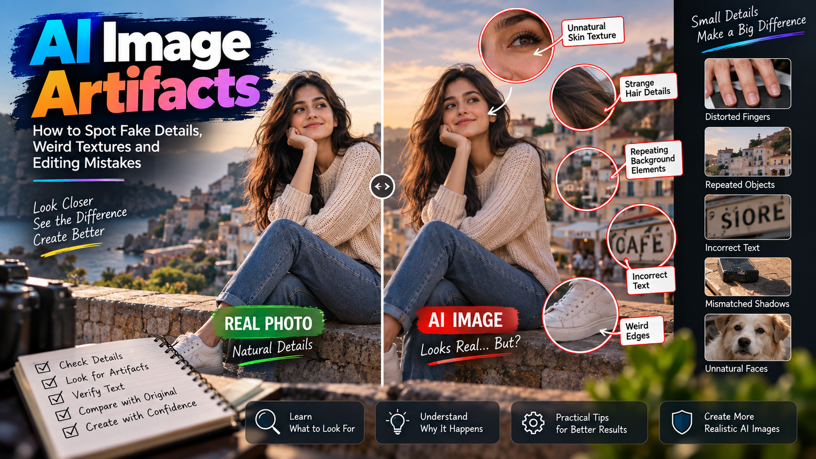
Generative systems can produce text that looks convincing at first glance but is actually incorrect.
For that reason, don’t assume that an AI-generated packaging image is accurate just because the overall design looks professional.
If the product package is important, use the real packaging photograph as the source and minimize regeneration of the package itself.
Google’s product-image guidance also emphasizes that images should accurately display the product and should not use promotional overlays or misleading elements.
Don’t Ask AI to “Make the Product Better”
This sounds harmless, but it can be a problematic instruction.
“Make the product better” doesn’t define what better means.
The AI could interpret it as permission to:
- Change the design
- Increase saturation
- Modify proportions
- Add details
- Remove imperfections
- Redesign packaging
Instead, describe the presentation change.
For example:
Weak instruction:
Make this product look premium.
Better instruction:
Improve the studio lighting, create a clean neutral background and add a subtle realistic contact shadow while preserving the product’s exact design, color, material, proportions and packaging.
The second instruction defines what “premium” actually means.
Creating a Clean Studio Look
A studio-style product image doesn’t necessarily require a physical studio.
AI can help simulate a clean environment around a real product photograph.
A useful editing direction could be:
Place the existing product on a clean neutral studio surface with soft diffused lighting and a subtle natural contact shadow. Preserve the exact product shape, color, material, packaging and branding. Keep the product as the primary focus and avoid adding unrelated objects.
The environment should support the product rather than compete with it.
Shadows Make Products Look Grounded
One of the biggest differences between a convincing product image and an obviously edited image is often the shadow.
Without a believable shadow, the product can appear to float.
A realistic product shadow should generally correspond with:
- Light direction
- Product position
- Surface
- Distance from the surface
- Light softness
A hard light source may create a sharper shadow.
A large diffused light source can create a softer shadow.
You don’t need to make every shadow dramatic.
For commercial product photography, a subtle contact shadow is often enough to establish that the product is sitting on the surface.
Avoid the Floating Product Problem
Imagine a bottle placed on a table.
If the AI creates a background but doesn’t establish contact between the bottle and the surface, the bottle can appear suspended.
Look at the bottom edge.
Does the product appear to touch the surface?
Is there a believable shadow?
Does the lighting around the base match the environment?
If not, the scene needs correction.
A useful instruction is:
Keep the product naturally grounded on the surface with a subtle contact shadow consistent with the direction and softness of the scene lighting.
Reflections Need Special Attention
Some products naturally interact with their surroundings.
Examples include:
- Glass bottles
- Mirrors
- Watches
- Metallic objects
- Glossy electronics
- Polished furniture
AI may generate reflections that look attractive but don’t correspond with the actual product.
For example, a metallic watch could receive a completely different reflection that changes the appearance of its surface.
When editing reflective products, preserve the actual material characteristics.
A good instruction might be:
Preserve the original material, surface finish and reflective characteristics of the product. Modify only the surrounding environment and maintain physically believable reflections.
Transparent Products Are More Difficult
Transparent objects can be challenging because the background may be visible through them.
Examples include:
- Glass bottles
- Transparent containers
- Acrylic products
- Clear packaging
- Glassware
When the background changes, the AI may incorrectly change what appears through the transparent area.
This can make the product look unrealistic.
For these products, inspect:
- Edges
- Highlights
- Refraction
- Transparency
- Background visible through the object
Don’t judge the result only from the full image.
Zoom in.
AI Can Help Create Lifestyle Scenes
Lifestyle photography is useful because it shows how a product fits into a real environment.
For example:
A desk lamp can be shown on a working desk.
A handbag can be shown in an appropriate everyday setting.
A coffee product can be presented on a breakfast table.
A skincare product can be shown in a clean bathroom environment.
But the generated environment should not make claims that aren’t true.
For example, don’t add accessories or features that imply the product includes items that aren’t actually sold with it.
Google’s guidance for additional product imagery allows staging and product-in-use views, which can help customers understand the product beyond the main image.
Don’t Add Unsold Accessories
Imagine you’re selling a camera body.
AI creates a beautiful lifestyle scene containing:
- Camera
- Lens
- Tripod
- Memory card
- Camera bag
If the listing only includes the camera body, the image could confuse the customer.
The visual presentation should clearly distinguish between:
Product included
and
Scene decoration.
When generating a lifestyle scene, tell the AI:
Keep only the listed product as the item being presented. Do not visually imply that additional accessories are included with the purchase.
This is particularly important for bundles and product variations.
Clothing and Wearable Products Need Another Approach
For clothing, showing the item on a person can help customers understand fit and appearance.
But the garment itself needs to remain accurate.
Watch for:
- Fabric texture
- Color
- Pattern
- Sleeve length
- Neckline
- Stitching
- Logo placement
- Overall fit
Google recommends showing apparel products worn by people and provides specific guidance for product images.
If AI generates a model wearing the garment, compare the garment with the original product photograph.
The model can change.
The product should not.
Don’t Let AI Change Product Variants
Suppose a store sells the same shirt in:
- Black
- White
- Blue
- Green
An AI editor might accidentally shift the color while improving lighting.
This can create the wrong variant image.
Google’s product-image guidance says the submitted image should match the product’s relevant variant information, such as color, pattern and material.
Therefore, review every variant separately.
Don’t assume that a single editing workflow will preserve every color correctly.
Image Resolution Matters
Even a beautifully edited product photograph can perform poorly if the source image is tiny or blurry.
Use the highest-quality original photograph available.
Google currently recommends providing high-resolution product imagery and notes that images around 1500 × 1500 pixels or above can help performance across listing formats. It also states that new 500 × 500 minimum requirements for product images are scheduled for enforcement beginning January 31, 2027.
For Shopify stores, product and collection images can be uploaded up to 5000 × 5000 pixels or 25 megapixels, with a 20 MB file-size limit; Shopify also notes that high-resolution images generally look more polished to customers.
The exact requirements of your selling platform should always be checked before uploading.
Don’t Confuse Upscaling With Better Photography
AI can increase apparent resolution, but that doesn’t mean missing product details magically become accurate.
If a logo is unreadable in the original image, AI may invent letters.
If a product edge is blurred, AI may reconstruct a shape that wasn’t actually captured.
If the original color is distorted, enhancement won’t necessarily restore the exact real-world color.
Start with a good photograph whenever possible.
AI should be an editing tool, not a substitute for accurate source material.
A Practical Workflow for AI Product Photo Editing
Instead of trying to create the perfect final image in one operation, use a controlled workflow.
Stage 1: Photograph the Product
Use the cleanest, sharpest original photograph available.
Make sure the product is fully visible.
Stage 2: Remove Minor Distractions
Clean small unwanted objects or background elements.
Don’t modify the product itself.
Stage 3: Create the Main Background
Choose a clean, neutral environment suitable for the product.
Stage 4: Correct Lighting
Make the light consistent without changing the actual product color.
Stage 5: Add a Natural Shadow
Ground the product on the surface.
Stage 6: Inspect the Product
Compare it against the original.
Check its:
- Shape
- Color
- Texture
- Logo
- Packaging
- Proportions
Stage 7: Create Lifestyle Variations
Only after the accurate main image is ready should you create more creative scenes.
Stage 8: Export and Review
Check the final image at full resolution before uploading it to your store.
This staged process makes it easier to identify where an unwanted change occurred.
How to Handle Different Product Types
Different products need different editing priorities.
Electronics
Focus on:
- Accurate shape
- Ports
- Buttons
- Screen details
- Branding
- Reflections
Avoid AI redesigning the hardware.
Cosmetics
Focus on:
- Packaging
- Label
- Bottle shape
- Product color
- Cap
- Texture
Be particularly careful with small text.
Clothing
Focus on:
- Fabric
- Pattern
- Color
- Fit
- Stitching
- Garment shape
Jewelry
Focus on:
- Metal finish
- Gemstone appearance
- Shape
- Small details
- Reflections
Jewelry often exposes AI artifacts because of its small, reflective surfaces.
Food Packaging
Focus on:
- Package design
- Label
- Product name
- Quantity information
- Colors
Don’t allow AI to invent nutritional or product information.
Product Images Should Answer Customer Questions
A strong product image isn’t simply beautiful.
It should help the customer understand the product.
Ask:
Can the customer see the product clearly?
Can they understand its shape?
Is the color believable?
Can they identify important features?
Does the image show what is actually included?
Does the lifestyle scene help explain how the product is used?
These questions are more valuable than simply asking whether the image looks “premium.”
When AI Editing Becomes Misleading
There is a line between improving presentation and changing reality.
Generally, be cautious when an edit changes something that could influence a purchasing decision.
Examples include:
- Making a product appear larger
- Changing its actual color
- Adding missing features
- Removing important defects
- Changing material appearance
- Adding accessories that aren’t included
- Altering packaging information
- Showing a different product variant
A visually impressive image isn’t useful if it gives customers the wrong impression.
AI Editing for E-Commerce Should Be Consistent
If you have twenty products in a store, don’t make every product image look completely different.
A consistent visual system can make a store feel more professional.
You might decide:
- Same background tone
- Similar product scale
- Similar lighting
- Consistent shadow style
- Similar cropping
- Similar camera perspective
This creates a recognizable visual language across the store.
The exact design can vary by brand, but consistency should be intentional.
Don’t Make Every Product Image Look Like an Advertisement
Another common mistake is excessive design.
Adding huge text, promotional badges, dramatic effects and decorative elements can distract from the product.
For primary product imagery, simplicity is often more useful.
Google’s Merchant Center guidance specifically warns against promotional text, watermarks and other elements that obstruct or misrepresent the product image.
Keep promotional graphics separate from the product photograph when your selling platform requires clean product imagery.
A Useful AI Editing Instruction
Instead of relying on a large collection of generic prompts, use an editing brief that describes the actual task.
For example:
Use the uploaded product photograph as the source reference. Improve the presentation by placing the exact product in a clean, realistic studio environment with soft, natural lighting. Preserve the product’s original shape, proportions, color, material, texture, branding, packaging and all visible details. Add a subtle contact shadow appropriate to the light direction. Do not redesign the product, add features, change its color or introduce accessories that are not part of the product. Keep the product as the main focus of the image and make the final result look like professionally photographed commercial product photography.
The important part isn’t memorizing these exact words.
The important part is understanding the structure:
Real product → controlled environment → accurate presentation → no invented features.
How to Check an AI-Edited Product Image
Before uploading the image to an online store, compare it with the original product photograph.
Product shape
Does it still have the same proportions?
Color
Does the product still have the correct color?
Material
Does the surface look like the actual material?
Branding
Are logos and labels unchanged?
Packaging
Is the packaging still accurate?
Accessories
Did AI add anything that isn’t included?
Shadows
Does the product sit naturally in the scene?
Perspective
Does the product look correctly positioned?
Edges
Are there strange outlines around the product?
Reflections
Do reflective surfaces behave naturally?
Small text
Is any generated text incorrect?
Variant
Is this definitely the correct product version?
This final inspection can prevent small AI errors from becoming customer-facing problems.
The Original Photograph Should Always Remain Your Reference
One of the biggest advantages of keeping the original is that you have something to compare against.
If an edited version looks attractive but you’re unsure whether the product has changed, return to the original.
Don’t rely entirely on memory.
Place the images side by side.
Compare:
Original product → Edited product
If the shape, color, packaging or important details have changed, either correct them or use the original image.
When Traditional Editing May Be Better
AI isn’t always the best choice.
Traditional photo-editing software can be more appropriate when you need extremely precise control over:
- Product edges
- Logos
- Packaging text
- Exact colors
- Technical diagrams
- Fine reflections
- Complex masking
A professional workflow can even combine both approaches.
For example:
AI: Generate or clean the environment.
Traditional editor: Refine the product edges and preserve exact branding.
This hybrid approach can provide more control than relying entirely on generative editing.
A Better Way to Build a Product Image Set
Instead of creating one AI image and using it everywhere, think about the customer journey.
Image 1: Identification
Clearly show the actual product.
Image 2: Alternate angle
Reveal another useful side.
Image 3: Detail
Show an important feature or texture.
Image 4: Lifestyle
Show how the product looks in use.
Image 5: Scale or context
Help the customer understand size or placement where appropriate.
Google recommends additional images to provide different views and useful product context, while structured product content can help customers understand the item more clearly.
This is much more useful than generating five nearly identical AI images.
The Goal Isn’t “AI-Looking” Photography
A successful AI-assisted product photograph should not necessarily look like it was made with AI.
In many cases, the best result is the opposite.
The customer should see:
- A clear product
- Accurate details
- Appropriate lighting
- Natural shadows
- A believable environment
- Professional composition
The technology should improve the workflow without becoming the subject of the photograph.
Final Principles
When using AI product photo editing, remember these principles:
Preserve the product.
Don’t let AI redesign what you’re selling.
Control the environment.
Use AI primarily to improve presentation.
Keep colors accurate.
Especially for products sold in multiple variants.
Protect branding.
Never assume AI-generated text is correct.
Use realistic shadows.
They help establish contact with the surface.
Inspect reflections.
Metal, glass and glossy surfaces can expose editing artifacts.
Separate main and lifestyle images.
One communicates accuracy; the other communicates context.
Compare against the original.
Never rely only on the final AI-generated image.
Don’t add misleading features.
The photograph should represent the actual product.
Use AI selectively.
More editing doesn’t automatically mean better product photography.
Conclusion
AI can make product photography faster and more accessible, but the best AI product photo editing workflow isn’t about transforming a product into something completely different.
It is about improving how the real product is presented.
Start with a high-quality original photograph. Decide which parts of the image can change and which details must remain fixed. Use AI for background cleanup, controlled scene creation, lighting improvements and other presentation tasks while protecting the product’s actual appearance.
For e-commerce, accuracy should always come before visual effects.
A clean background, realistic shadow, balanced lighting and professional composition can make a product photograph considerably stronger without changing the product itself.
The most useful AI-edited product image is ultimately the one that looks professional and still gives the customer an honest visual representation of what they are buying.