If you create AI images for Instagram, websites, thumbnails, posters or printing, you may eventually come across two terms: RGB and CMYK.
At first, they can seem like technical settings that only professional designers need to understand. But they actually explain something very practical: how colors are represented on a screen versus how they are produced on paper.
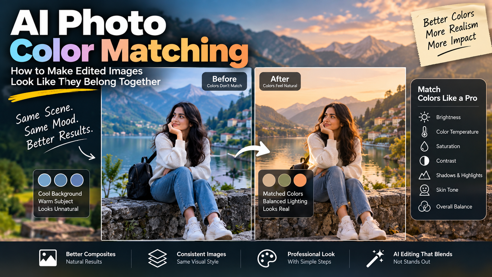
This becomes especially important with AI-generated images because an image can look perfect on your phone and then appear noticeably different after printing.
A bright blue may become darker. A vivid red may look less intense. Some neon-looking colors may simply not reproduce the same way on paper.
Understanding RGB vs CMYK for AI images can help you avoid those surprises and choose the right workflow before you export or print your work.
RGB and CMYK Are Different Ways of Representing Color
Let’s start with the basic idea.
RGB stands for:
- Red
- Green
- Blue
It is primarily associated with digital displays.
CMYK stands for:
- Cyan
- Magenta
- Yellow
- Key/Black
It is primarily associated with printing.
The important difference isn’t just the names.
RGB and CMYK represent color using two fundamentally different approaches.
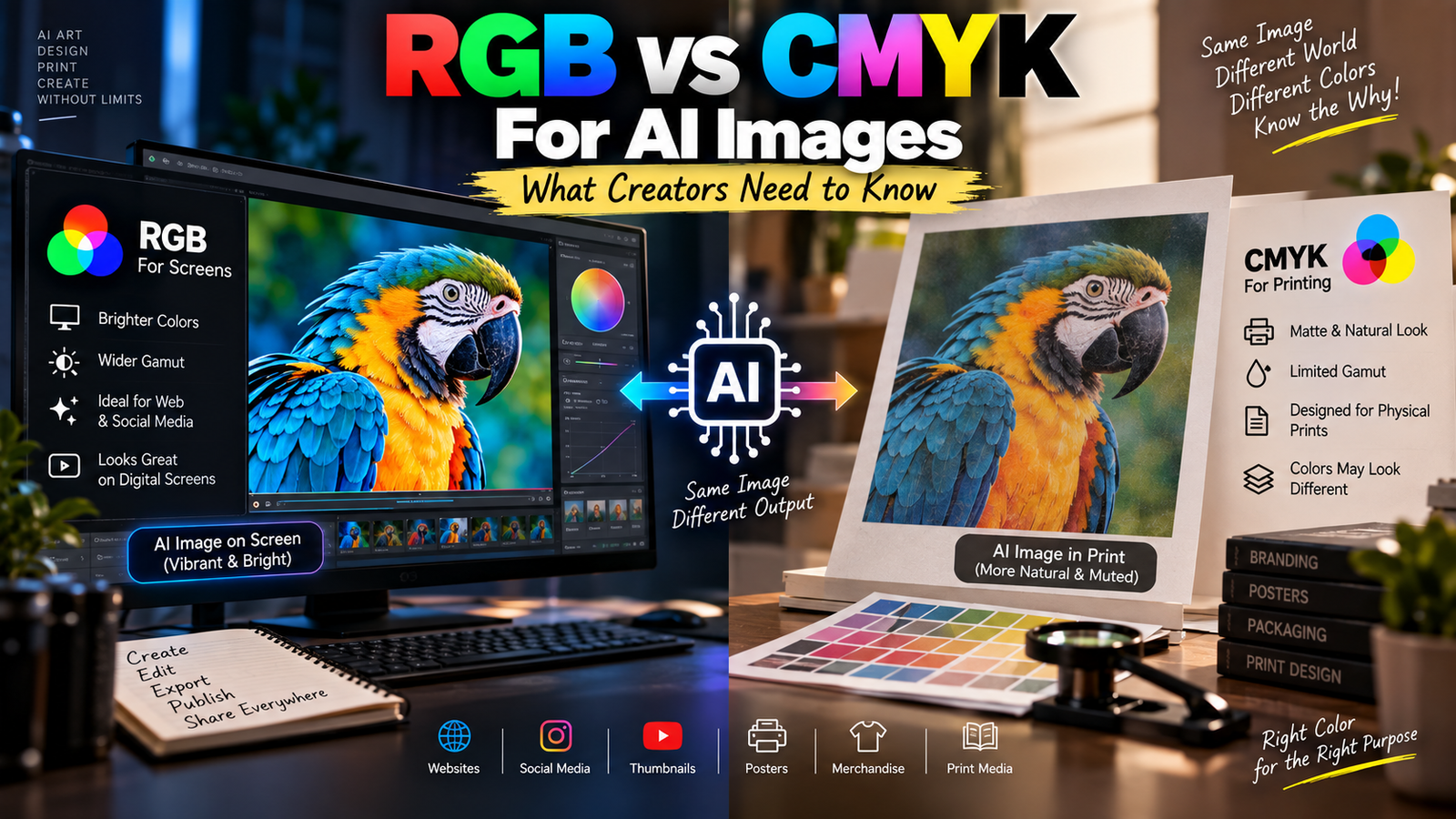
RGB is based on light.
CMYK is based on ink or pigment.
That’s why a color that looks extremely bright on a phone screen may not look exactly the same when printed.
Why Screens Use RGB
Your phone, monitor, television and tablet produce images using light.
Small components on the display emit different amounts of red, green and blue light.
By combining these channels at different intensities, the screen can produce a huge range of colors.
For example, a pixel can contain different amounts of:
Red + Green + Blue
and the combination determines the color you see.
When all three channels are displayed at their maximum intensity, the result is white.
When they’re all at their minimum, the result is black.
This is why RGB is described as an additive color model.
You’re adding light.
Why Printing Uses CMYK
Paper doesn’t emit light in the same way a screen does.
Instead, printing generally involves ink placed onto a surface.
CMYK uses cyan, magenta, yellow and black inks to reproduce colors.
The inks absorb portions of incoming light and reflect other portions back toward your eyes.
This is why printed color behaves differently from a glowing screen.
A display can produce extremely bright colors by emitting light directly.
Paper can’t do that in the same way.
The Easiest Way to Remember RGB vs CMYK
A simple rule is:
RGB → Screens
CMYK → Printing
This isn’t an absolute rule for every professional workflow, but it’s an excellent starting point.
If you’re preparing an AI image for:
- A website
- YouTube
- A digital advertisement
- A phone wallpaper
you’re generally working in a screen-based environment.
If you’re preparing artwork for:
- Business cards
- Flyers
- Posters
- Brochures
- Packaging
- Printed photographs
the printing workflow becomes more important.
Why an AI Image Usually Starts as RGB
AI image-generation and editing workflows are primarily digital.
You’re looking at the image on a screen.
The image is represented digitally and eventually displayed using a device that works with RGB color information.
So when you generate an AI photograph, you generally don’t need to think about CMYK immediately.
The more important question is:
Where is this image going next?
If it’s staying digital, RGB is usually the natural environment.
If it’s going to a commercial printer, you may need to prepare it according to that printer’s requirements.
AI Does Not Automatically “Understand” Your Final Print
This is an important distinction.
An AI model can generate an image with beautiful colors.
But it doesn’t mean the final printed version will look identical to the version you saw on your monitor.
The AI is creating visual content.
The printer is dealing with a physical reproduction process.
Those are two different stages.
For example, an AI-generated image might contain a very saturated electric blue.
It can look spectacular on a modern phone display.
When printed, the same color may become less vivid because the physical printing process has different limitations.
Why Some AI Colors Look Too Bright to Print
Screens can display colors that are difficult or impossible to reproduce exactly using standard printing inks.
This is related to something designers call color gamut.
A color gamut is essentially the range of colors that a particular system can reproduce.
Your phone has one possible color range.
A particular printer and paper combination has another.
These ranges aren’t identical.
So there can be colors that exist comfortably inside your display’s capabilities but fall outside what a particular printing process can reproduce.
When that happens, the color may need to be converted to something printable.
The replacement may look slightly different.
What Does “Color Gamut” Actually Mean?
You don’t need advanced color science to understand it.
Think of a gamut as a box of available colors.
One system might have a larger box.
Another might have a smaller box.
If your AI image contains a color outside the second box, that system has to find the closest practical alternative.
This is one reason the same image can appear different across:
- Phones
- Monitors
- Tablets
- Printers
Color management exists partly to control these differences.
Why Your Phone and Monitor May Already Show Different Colors
Even before printing, you may notice differences between devices.
One phone may have:
- Higher brightness
- More saturated colors
- A warmer display
- A cooler white point
Another monitor may show the same image differently.
That means there isn’t always one single “absolute appearance” of an image on every screen.
The AI-generated file contains color information.
The display determines how that information is presented to your eyes.
This is another reason not to judge a print only by looking at one phone.
What Is a Color Profile?
A color profile helps software understand how colors in a file should be interpreted.
You may encounter terms such as:
- sRGB
- Adobe RGB
- Display P3
- CMYK profiles
You don’t need to memorize every profile.
But one is especially important for everyday web creators:
sRGB.
Why sRGB Matters for Websites
sRGB is a widely used color space for digital images.
If you’re preparing images for a website, blog or social media, sRGB is generally a safe and practical choice unless a platform or workflow specifically requires something else.
This is particularly relevant for AI-created images.
You might generate a beautiful image, edit it, export it and upload it to your website.
If the color profile is handled poorly during the workflow, colors may appear different from what you expected.
For a general web workflow, keeping things simple with an appropriate sRGB export is often sensible.
What Is Adobe RGB?
Adobe RGB is a wider-gamut color space often associated with photography and professional workflows.
It can represent a broader range of colors than standard sRGB in certain areas.
That can be useful when you’re working through a controlled photography and printing workflow.
But there’s a catch.
A wider color space isn’t automatically better for every situation.
If a website or application expects a different color space and handles the file poorly, you can encounter unexpected color differences.
For everyday web publishing, compatibility is often more important than simply choosing the largest possible color space.
What Is Display P3?
You may also encounter Display P3, especially when working with modern phones, tablets and displays.
It provides a wider color range than sRGB in many areas.
This can allow compatible devices to display more vivid colors.
But not every workflow handles wide-gamut images in exactly the same way.
If your goal is predictable web compatibility, it’s still important to understand what the destination platform supports rather than assuming that a wider gamut is automatically preferable.
AI Images and Neon Colors
AI image generators are very good at producing visually striking colors.
You may generate:
- Neon pink
- Electric blue
- Bright purple
- Glowing green
- Cyberpunk lighting
These can look fantastic digitally.
But if the image is going to print, some of those colors may need to be adjusted.
The result may still look good, but it won’t necessarily be identical to the screen version.
This isn’t necessarily an AI problem.
It’s a difference between light-based display and physical printing.
Why Black Is Different in RGB and CMYK
Black provides another easy way to understand the difference.
In RGB:
R = 0
G = 0
B = 0
represents black.
You’re essentially displaying no light from those channels.
CMYK has a dedicated K, or black, channel.
That’s partly because using black ink separately can provide practical benefits in printing, including stronger text and better control over dark areas.
This is one reason CMYK isn’t simply “RGB with different letters.”
The two systems were designed around different physical processes.
What Does K Mean in CMYK?
People sometimes wonder why black is represented by K rather than B.
The reason is mainly to avoid confusion with the B in RGB.
K refers to the key plate, traditionally associated with the black printing plate.
So:
C = Cyan
M = Magenta
Y = Yellow
K = Key/Black
It’s a small detail, but it makes the abbreviation easier to understand.
Why Converting RGB to CMYK Can Change an AI Image
Suppose your AI image is created and edited in RGB.
You then convert it to CMYK for printing.
The software has to translate the colors from one color space into another.
If every RGB color has a direct equivalent in the CMYK space, the conversion can be relatively straightforward.
But if some colors fall outside the printable range, they need to be adjusted.
That’s when you may notice:
- Reduced saturation
- Different blues
- Changed greens
- Less vibrant purples
- Altered shadows
The image isn’t necessarily broken.
The color system has changed.
Don’t Convert to CMYK Just Because You Heard Printing Uses CMYK
This is a common beginner mistake.
Someone hears:
Printing = CMYK.
Then they immediately convert every image to CMYK.
That’s not always the best workflow.
Different printers and printing services can have different requirements.
Some may specifically request a particular CMYK profile.
Others may accept RGB files and perform their own conversion.
The safest approach is:
Ask the printer what file format, color profile and specifications they require.
Don’t guess.
The Printer’s Requirements Matter More Than a Generic Rule
Imagine you’re creating a poster.
Printer A says:
Send an RGB JPEG.
Printer B says:
Send a CMYK PDF using our specific profile.
Both can be legitimate workflows.
So the question isn’t:
“Is RGB always better?”
or:
“Is CMYK always better?”
The better question is:
“What does the final production workflow require?”
That’s how professional color management works.
AI Images for Instagram
If your image is only going to Instagram or another digital platform, you generally don’t need to convert it to CMYK.
You’re creating content for screens.
A practical workflow is:
AI generation → editing → RGB/sRGB export → upload
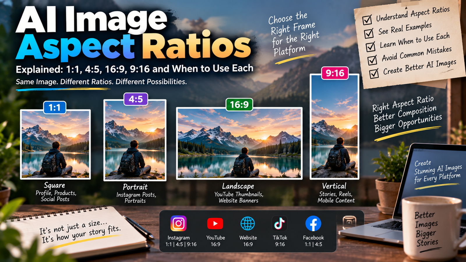
The exact recommended dimensions and compression settings can vary by platform, but the basic color concept remains the same.
AI Images for Websites
For blog posts and websites, RGB is normally the appropriate environment.
After editing, you should also think about:
- Dimensions
- File size
- Compression
- Image format
- Color profile
This is where our previous article on JPEG vs PNG vs WebP becomes useful.
Color management and file format are separate decisions.
You can have a correctly prepared RGB image and still choose a poor file format for the intended use.
AI Images for Posters
Posters are different because they may be viewed both digitally and physically.
If you’re designing a poster that will be printed, establish the print requirements before finalizing the artwork.
Ask the printer about:
- Final dimensions
- Bleed
- Resolution
- Color profile
- File format
- PDF requirements
- Paper type
Don’t wait until the final hour to discover that the printer wants a particular profile.
AI Images for T-Shirts and Merchandise
Merchandise introduces even more variables.
A printed photograph on a shirt doesn’t behave exactly like a photograph displayed on a screen.
The printing process, fabric, ink and production method all affect the final appearance.
If you’re creating AI artwork for merchandise, the supplier’s specifications are especially important.
The correct color workflow depends on the printing method being used.
Why Paper Type Changes Color
Even after you prepare a correct print file, the paper matters.
A glossy photo paper and a matte paper can produce different appearances.
The same ink can look different depending on:
- Surface
- Brightness
- Coating
- Absorption
This means color management isn’t simply about converting RGB to CMYK.
The entire production chain matters.
Why AI Images With Gradients Need Attention
AI-generated graphics often contain smooth gradients.
For example:
- Purple-to-blue backgrounds
- Sunset skies
- Neon glows
- Soft studio lighting
When these are displayed digitally, they can look smooth.
During compression, color conversion or printing, subtle transitions can sometimes become more noticeable.
That’s why checking the final output is more useful than assuming the original AI image will reproduce perfectly.
AI Images With Skin Tones Need Extra Care
Skin is another area where small color differences are easy to notice.
A screen may show a warm, natural complexion.
After a color conversion or printing process, the skin can appear:
- Too yellow
- Too red
- Too dull
- Too dark
This is one reason portrait images should be checked carefully before printing.
If you’re already concerned about preserving natural skin during AI editing, our guide on how to fix lighting in photos with AI without changing skin tone covers the editing side of that problem.
Why You Should Not Judge Print Color From a Bright Phone
This is a surprisingly common mistake.
Phone displays can be extremely bright.
Paper isn’t.
When you look at a glowing screen in a dark room, the image can appear much more vibrant than a physical print under ordinary lighting.
So don’t assume:
“The screen looks amazing, therefore the print will look exactly the same.”
The display and print are fundamentally different viewing environments.
Soft Proofing Can Help
Professional workflows sometimes use soft proofing.
The basic idea is to preview how an image may behave under a particular printing condition before actually printing it.
This can help identify colors that may change during the print process.
It’s more advanced than most casual creators need, but it’s useful to know that professional color workflows don’t simply convert files and hope for the best.
They attempt to predict the final output.
What Beginners Should Do With AI Images
If you’re creating images for digital use, keep the workflow simple.
For websites
Work in RGB and use an appropriate web export.
For social media
Stay in a screen-friendly RGB workflow.
For digital graphics
RGB is generally the natural starting point.
For printing
Check the printer’s requirements before converting anything.
For professional print production
Use the requested color profile and proof the result when necessary.
This avoids the common mistake of treating RGB and CMYK like a simple quality setting.
RGB Is Not “Better” Than CMYK
This is worth making completely clear.
RGB isn’t a higher-quality version of CMYK.
CMYK isn’t a lower-quality version of RGB.
They solve different problems.
RGB is designed around light-producing displays.
CMYK is designed around ink-based printing.
Asking which one is “better” without specifying the final destination is like asking whether a television or a printer is better.
They aren’t competing for the same job.
What About AI Tools That Don’t Let You Choose?
Many AI image tools hide technical color settings from the user.
That’s normal.
You don’t necessarily need to manually select RGB every time you generate an image.
The important decisions often happen during the later editing and export stages.
If you’re simply creating a social-media photograph, you may never need to think about CMYK at all.
The issue becomes important when the image enters a professional print workflow.
A Practical Workflow for Digital AI Images
For a website or social media:
1. Generate the image
Create the AI image at an appropriate resolution.
2. Edit it
Make your required changes.
3. Check colors
Look for unnatural skin tones, clipped highlights and excessive saturation.
4. Export appropriately
Use a suitable RGB/web workflow.
5. Optimize the file
Balance quality and file size.
6. Upload
Check the final online appearance.
This is usually all a digital creator needs.
A Practical Workflow for Printed AI Images
For printing:
1. Decide the physical size
Know how large the final image will be.
2. Ask the printer for specifications
Don’t guess the color profile.
3. Prepare the image
Make sure resolution is appropriate for the print size.
4. Convert only if required
Use the printer’s requested profile.
5. Inspect colors
Pay attention to skin, gradients and saturated colors.
6. Proof if necessary
For important work, a physical proof can reveal problems that a screen preview won’t.
7. Send the final file
Follow the printer’s requested format.
This approach is much safer than blindly converting everything to CMYK.
Common RGB vs CMYK Mistakes
Mistake 1: Converting every AI image to CMYK
Not necessary for digital images.
Mistake 2: Assuming CMYK means better quality
It doesn’t.
Mistake 3: Ignoring the printer’s profile
Different workflows can have different requirements.
Mistake 4: Judging print colors only on a phone
Screens and paper behave differently.
Mistake 5: Using extremely saturated AI colors without checking print output
Some colors may not reproduce as expected.
Mistake 6: Forgetting about the final image format
Color profile, resolution and compression all matter.
Mistake 7: Editing the only copy
Keep your original RGB master before making print-specific conversions.
Keep an RGB Master File
This is a particularly useful habit.
Suppose you create an AI image for multiple purposes:
- Website
- Poster
- Flyer
Don’t permanently convert your only master file into a print-specific format and then try to use it everywhere.
Keep the original high-quality version.
Then create destination-specific exports.
For example:
Master image
↓
Web export
↓
Social media export
↓
Print version
This gives you much more flexibility.
RGB vs CMYK for AI Images: The Simple Decision
If you’re still confused, use this quick guide.
| Where the AI image will be used | Usually think about |
|---|---|
| RGB | |
| Website | RGB |
| YouTube thumbnail | RGB |
| Phone wallpaper | RGB |
| Digital advertisement | RGB |
| Poster | Printer’s requirements |
| Business card | Printer’s requirements |
| Magazine | Printer’s requirements |
| Packaging | Printer’s requirements |
| Professional print | Required CMYK/profile or printer workflow |
The key word is usually.
Always follow the specifications of the actual platform or print provider when they give you explicit requirements.
Why Understanding Color Helps With AI Editing
You don’t need to become a professional color scientist.
But understanding RGB and CMYK changes the way you think about AI images.
You start to realize that:
The image file isn’t the final physical product.
It’s a digital representation that will eventually be displayed or reproduced somewhere.
A photograph viewed on a phone is one experience.
The same photograph printed on paper is another.
The AI-generated image is the starting point—not necessarily the final appearance in every environment.
The Bigger Lesson
This topic connects to a larger principle in digital image editing.
An image always exists inside a workflow.
The workflow might be:
AI → Instagram
or:
AI → Photoshop → Website
or:
AI → Design software → Printer → Paper
Every stage can affect the final result.
The more important the image is, the more you should think about where it is going before you export it.
Final Thoughts
RGB vs CMYK for AI images isn’t really a competition between two formats.
They’re two different approaches to representing color for different environments.
RGB is primarily associated with digital displays, where colors are produced using light. CMYK is primarily associated with physical printing, where colors are produced using ink.
For Instagram, websites, digital graphics and other screen-based work, an RGB workflow is generally the practical choice.
For printing, the correct approach depends on the printer, printing process and required color profile. Don’t automatically convert an AI image to CMYK simply because you’re planning to print it. Check the production requirements first.
Most importantly, keep a high-quality master version of your AI artwork and create separate exports for different destinations.
Once you understand that screen color and printed color are different environments, many of the strange color changes people experience with AI images become much easier to understand.
The goal isn’t to find one “best” color mode.
The goal is to prepare the image correctly for where it is actually going.